How to Build a Responsive Web Design
Key Takeaways:
- Build your website with flexible sizing tools like CSS Grid, Flexbox, and scalable units so it looks great on any screen, from phones to desktops.
- Let website components adjust based on the space they have, not just the overall screen size. This keeps your design looking consistent across different layouts.
- A fast website helps your SEO. Compress images and prevent page elements from shifting while loading. A faster, more stable website improves user experience and can boost your Google rankings.
- Ensure your website is accessible for everyone, including people with disabilities. If your business operates in Singapore, also follow local accessibility standards and privacy requirements.
- Keep your code clean and simple. Use modern CSS techniques to reduce unnecessary code. This makes your website faster, easier to update, and less likely to run into problems in the future.
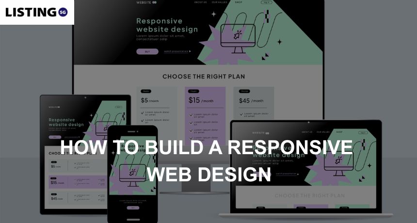
Responsive web design is an approach to web development that creates dynamic websites capable of automatically adjusting their layout, content, and imagery to fit any screen size, device orientation, or container width. Using flexible fluid grids, flexible media, and CSS media or container queries, it ensures an optimal viewing experience across mobile devices, tablets, and desktops.
Responsive web design is no longer just about adjusting layouts for different screen sizes. Today, people browse websites on a wide range of devices, so your site needs to adapt naturally to any screen.
This guide helps developers, UI/UX designers, and tech leads build responsive websites using modern CSS best practices. You’ll learn how to create flexible layouts, improve Core Web Vitals, and build websites that are accessible, easy to maintain, and compliant with standards like WCAG 2.1 AA and PDPA.
Why Is a Responsive Website Important?
A responsive website automatically adjusts to different screen sizes, giving visitors a smooth experience whether they’re using a smartphone, tablet, or desktop computer.
Today, most web traffic comes from mobile devices. If users have to zoom in, scroll sideways, or struggle to tap buttons, they’re likely to leave your website within seconds.
Responsive design also plays an important role in SEO. Google uses mobile-first indexing, which means it primarily evaluates the mobile version of your website when deciding how it should rank in search results.
Working with experienced web design companies in Singapore can help businesses create responsive websites that are fast, accessible, and built for modern user expectations.
A well-built responsive website also improves Core Web Vitals, especially Cumulative Layout Shift (CLS). CLS measures how stable your page is while it loads. If text, images, or buttons suddenly move around, it creates a poor user experience and can affect your search rankings.
Instead of maintaining separate mobile and desktop websites, a responsive design lets you:
- Manage a single website faster
- Make websites easier to maintain
- Delivers a consistent experience across all devices.
Core Components of Responsive Website Design
A modern responsive website is built on five key elements that help it adapt smoothly to different screen sizes.
1. Viewport Meta Tag
The viewport meta tag tells mobile browsers to display your website based on the device’s actual screen width. This ensures your pages scale correctly on smartphones and tablets.
2. Flexbox
Flexbox is a CSS layout tool that makes it easy to arrange and align content in rows or columns. It automatically adjusts spacing, making layouts more flexible across different screen sizes.
3. CSS Grid
CSS Grid is ideal for creating more complex page layouts, such as multi-column sections, product cards, image galleries, and dashboards. It gives you greater control over how content is displayed.
4. Container Queries
Container queries allow individual sections of your website to respond to the size of their own container instead of the entire browser window. This makes reusable components more flexible and consistent.
5. Responsive Images
Responsive images load the most suitable image size for each device. Using formats like SVG, srcset, and the <picture> element helps improve page speed while keeping images sharp on all screen sizes.
How to Build a Responsive Website: Step-by-Step
Step 1: Add the Viewport Meta Tag
Start by adding the viewport meta tag inside the <head> section of your HTML. This tells mobile browsers to display your website using the device’s screen width, so your layout scales correctly.
<meta name="viewport" content="width=device-width, initial-scale=1.0"> Step 2: Build with a Mobile-First Layout
Design for mobile devices first, using fluid CSS Grid patterns to create layouts that adapt automatically across screen sizes without requiring unnecessary media queries.
.card-grid {
  display: grid;
  grid-template-columns: repeat(auto-fit, minmax(280px, 1fr));
  gap: 1.5rem;
}
Step 3: Use Fluid Typography
Avoid fixed font sizes. Instead, use rem units together with clamp() so your text automatically scales to different screen sizes. This improves readability and prevents text from overflowing on smaller devices.
Step 4: Make Components Responsive with Container Queries
Use container queries so each component adjusts based on the space available, not just the browser size. This makes reusable elements like cards and widgets more flexible.
.card-wrapper {
  container-type: inline-size;
}

@container (min-width: 400px) {
  .card {
    display: flex;
    flex-direction: row;
  }
}
Step 5: Optimise Images for Speed
Always set the width and height of your images to prevent layout shifts while the page loads. Use srcset to deliver the best image size for each device, helping your website load faster and improve SEO.
<img src="photo-800.jpg"
     srcset="photo-400.jpg 400w, photo-800.jpg 800w"
     sizes="(max-width: 600px) 100vw, 50vw"
     width="800"
     height="500"
     alt="Example responsive image"
     loading="lazy"
>
By following these five steps, you can build a responsive website that looks great on any device, loads quickly, and provides a better experience for both users and search engines.
Singapore Website Accessibility & Compliance Guidelines
If your website serves users in Singapore, responsive design is only part of the equation. You should also follow local accessibility and privacy requirements to provide a better user experience and stay compliant.
Follow Accessibility Standards
The Singapore Government’s Digital Service Standards (DSS) recommend following WCAG 2.1 Level AA to make websites accessible to everyone, including people with disabilities.
Some best practices include:
- Make buttons and links large enough to tap easily on mobile devices (aim for at least 44 × 44 pixels for optimal touch usability, meeting WCAG Level AAA recommendations and WCAG 2.2 AA 24 × 24 pixel minimums).
- Use clear, readable text with good colour contrast.
- Ensure your website can be navigated using a keyboard and screen readers.
These improvements not only enhance accessibility but also create a better experience for all users.
Design Mobile-Friendly Privacy Notices
If your website collects personal data, your cookie banners and privacy notices should work well on all screen sizes.
Under Singapore’s Personal Data Protection Act (PDPA), businesses should provide clear and transparent privacy information. On mobile devices, make sure your cookie consent pop-ups:
- Are easy to read and interact with.
- Do not cover important website content.
- Allow users to accept, reject, or manage their preferences without difficulty.
By combining responsive design with accessibility and privacy best practices, you can create a website that is user-friendly, compliant, and trusted by visitors.
Conclusion: Modernizing Your Digital Presence
Building a high-performing responsive website requires modern CSS techniques, strong mobile UX practices, and optimized performance. Whether you run an e-commerce store or a service-based business, a fast and user-friendly website helps improve engagement and conversions.
For businesses needing professional support, Listing.sg connects you with trusted Singapore web design companies.
Browse our Singapore business directory today to find web design companies that specialize in responsive development, website optimization, and digital solutions.
Sources:
- W3C Web Accessibility Initiative (WAI): WCAG 2.1 SC 2.5.5 Target Size & WCAG 2.2 SC 2.5.8 Target Size (Minimum)
- GovTech Singapore: Digital Service Standards (DSS) Baseline Design Practices
- Mozilla Developer Network (MDN): CSS Grid Layout & minmax() Function
- Google Web Developers (web.dev): Optimizing Cumulative Layout Shift (CLS)
- Personal Data Protection Commission (PDPC) Singapore: Advisory Guidelines on Key Concepts of the PDPA
Frequently Asked Questions About Responsive Web Design
What is the main difference between media queries and container queries?
Media queries evaluate the dimensions of the entire browser viewport, whereas container queries evaluate the width of a specific parent container element, making container queries far better for modular UI component design.
Why is the viewport meta tag necessary?
Without the viewport meta tag, mobile web browsers default to rendering pages at standard desktop width (usually 980px) and zooming out, making text and elements tiny and unreadable.
How does responsive web design prevent Cumulative Layout Shift (CLS)?
By using CSS aspect-ratio properties and specifying explicit height and width attributes on media elements, responsive layouts reserve exact structural space on screen before images or videos finish downloading.
What touch target size is required for Singapore WCAG 2.1 AA compliance?
GovTech Digital Service Standards recommend a minimum interactive touch target size of 44×44 CSS pixels for all clickable or tapable elements on mobile devices.
How do responsive images save bandwidth on mobile networks?
Using HTML srcset allows browsers to automatically download smaller, lower-resolution image files on mobile phones while serving high-resolution files only to retina desktop screens.
What is the difference between mobile-first design and responsive web design?
Mobile-first design means creating your website for smaller screens first, then expanding the layout for tablets and desktops. Responsive web design is the overall approach that helps your website automatically adjust to different screen sizes using flexible layouts, scalable text, and modern CSS techniques.